
Typography can make or break a design. Whether you’re building a landing page, crafting a logo, or laying out an editorial spread, knowing how to pair fonts is one of the most valuable skills a designer can develop. Yet font pairing remains one of the most misunderstood corners of design, with too many people relying on guesswork or trendy combinations that fall apart six months later.
In this guide, we’ll walk through the actual principles behind successful font pairing, show you combinations that work in the real world, and highlight the mistakes that quietly ruin otherwise strong designs.
Why Font Pairing Matters More Than You Think
Fonts carry emotion. A single typeface can whisper elegance, shout urgency, or feel like a friendly conversation over coffee. When you combine two or more fonts, you’re not just picking shapes, you’re orchestrating a mood. Get it right and your design feels intentional and confident. Get it wrong and everything looks amateur, even if every other element is polished.
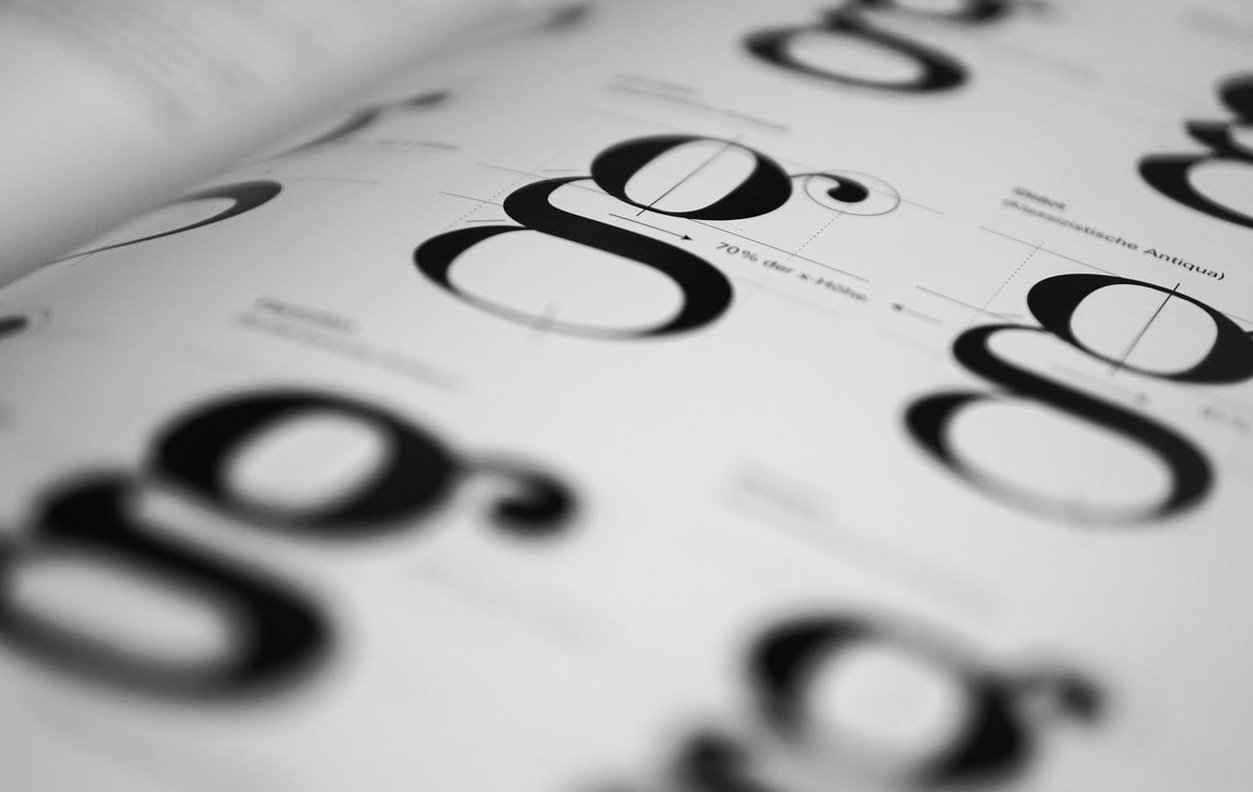
The Three Core Principles of Font Pairing
Before you start browsing font libraries, internalize these three principles. They apply to every project, from wedding invitations to SaaS dashboards.
1. Contrast
Fonts should be different enough to be distinguishable, but not so different they feel unrelated. Contrast can come from:
- Style: serif paired with sans serif
- Weight: light paired with bold
- Scale: large headline with small body text
- Structure: geometric paired with humanist
The classic mistake is choosing two fonts that are too similar. If you place two humanist sans serifs side by side, viewers sense something is off without knowing why. The fonts fight for the same visual space.
2. Hierarchy
Every pairing needs a clear leader. One font is your headline voice, the other is your supporting voice. This is what Adobe’s design team calls the anchor font approach: pick one font first, commit to it, then choose companions around it.
Hierarchy tells the reader where to look first, second, and third. Without it, everything screams for attention and nothing gets heard.
3. Mood
Fonts have personality. A slab serif feels sturdy and confident. A rounded sans serif feels friendly and modern. A high-contrast serif feels luxurious. When you pair fonts, their moods should either reinforce each other or create an intentional tension. Pairing a playful script with a technical monospace font might work for a specific brand, but it’s rarely accidental.
The Practical Font Pairing Framework
Here’s a step by step process you can apply to any project:
- Define the mood in three adjectives. Example: modern, trustworthy, warm.
- Choose your anchor font. This is usually the font you’ll use for body text or the most prominent element.
- Identify what’s missing. Does your anchor need a bolder companion for headlines? A more decorative one for accents?
- Test contrast. Place the two fonts together at real sizes and check readability.
- Limit yourself. Two fonts is ideal. Three is the maximum. More than that and your design loses coherence.
Font Pairings That Work in 2026
Here are combinations that hold up well across web, print, and branding projects:
| Headline Font | Body Font | Best For |
|---|---|---|
| Playfair Display | Source Sans Pro | Editorial, luxury brands |
| Inter | Inter (lighter weight) | SaaS, tech products |
| Fraunces | Nunito | Warm, human brands |
| Space Grotesk | IBM Plex Sans | Modern, technical |
| Cormorant Garamond | Lato | Classic, refined |
| Bebas Neue | Montserrat | Bold, sporty |
The Superfamily Shortcut
If you’re feeling uncertain, use a superfamily. These are font families designed with both serif and sans serif versions built to work together. Examples include IBM Plex, Roboto, Source, and Noto. Because they share the same skeleton, pairing them is essentially foolproof, and you still get meaningful contrast.
Common Font Pairing Mistakes
Even experienced designers fall into these traps:
Pairing Two Similar Fonts
Two geometric sans serifs. Two transitional serifs. Your eye can’t tell them apart, so the pairing looks like a mistake rather than a design choice.
Using Too Many Fonts
Three fonts should be your absolute ceiling. Beyond that, hierarchy breaks down and the design feels chaotic. If you need more variety, use different weights and sizes within your existing fonts.
Ignoring the Body Text
Designers spend hours picking the perfect display font and then default to Arial for body copy. The body font is where readers spend most of their time. Choose it with as much care as your headline.
Chasing Trends
Trendy fonts date quickly. A pairing that feels fresh today can look dated within two years. Balance current styles with timeless choices.
Forgetting About Real Content
Font pairings look great in isolation but fall apart when applied to actual content. Always test with real headlines, real paragraphs, and real UI elements before committing.
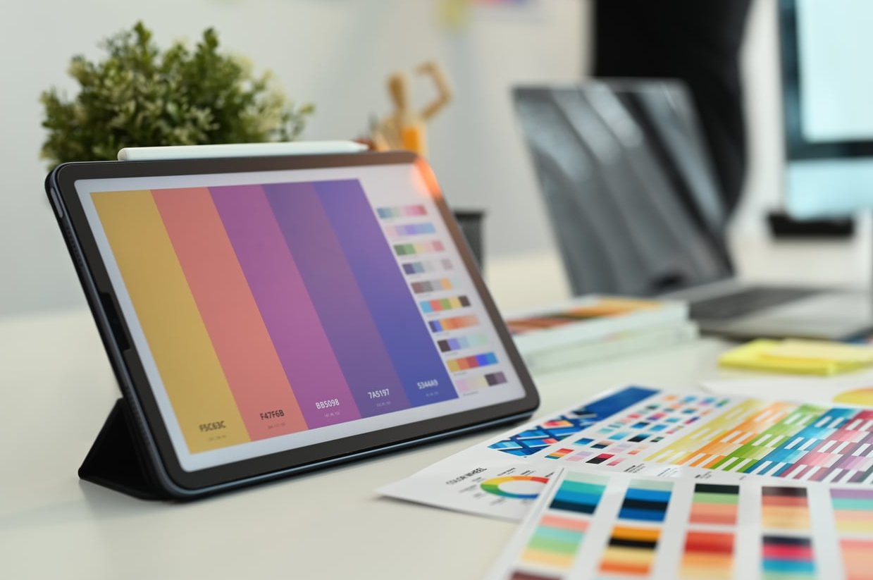
Tools to Speed Up Your Workflow
- Fontpair.co: Curated Google Font combinations you can preview instantly
- Adobe Fonts Recommendations: Suggests pairings based on any font you select
- Monotype Font Pairing Generator: Randomized pairings with quick like or dislike voting
- Figma: Test pairings directly inside your design file with real content
These tools are excellent starting points, but remember, a generator can’t replace design judgment. Use them for inspiration, then refine with intent.
Building Your Font Pairing Intuition
The best way to develop a feel for font pairing is to study designs you love. Screenshot magazine covers, poster art, and websites that catch your eye. Identify the fonts used and note why the pairing works. Over time, you’ll build a mental library of proven combinations and the principles behind them.
Font pairing is part science, part craft. The science is the principles we covered: contrast, hierarchy, mood. The craft is the taste you develop through practice, observation, and iteration.
FAQ
How many fonts should I use in one design?
Two is ideal. Three is the maximum for most projects. Any more than that and you risk visual chaos and weakened hierarchy.
Can I pair two serif fonts together?
Yes, but only if they have strong stylistic contrast. Pair a high contrast display serif with a humble text serif, for example. Two similar serifs will clash.
What is the safest font pairing for beginners?
A superfamily like IBM Plex or Source. You get built in harmony between serif and sans serif versions, making it almost impossible to go wrong.
How do I pair handwritten or script fonts?
Use them sparingly, only for accents or short headlines. Pair them with a clean, neutral sans serif that lets the script shine without competing for attention.
Should headline and body fonts always be different?
Not necessarily. Using the same font at different weights and sizes is a valid and increasingly popular choice, especially in modern web design. It creates coherence and simplicity.
How do I know if a font pairing is working?
Squint at the design. If the hierarchy is still clear and nothing feels visually off, your pairing is likely working. If elements blend together or fight for attention, revisit your contrast and mood choices.