
You approve a design on screen. The blue is electric, the green almost glows. Two days later the printed box arrives and the blue looks like a school uniform and the green looks like cooked spinach. Nobody made a mistake at the press. The file was simply built in the wrong color space. jukeboxprint.com walks through the specifics.
The RGB vs CMYK question is not a theory debate. It decides whether you approve a proof once or pay for a reprint. Here is the practical version: what each mode actually does, which colors betray you first, and the exact click-by-click workflow to convert files in Illustrator and Photoshop without watching your brand color collapse.
The short answer
- RGB = light. Use it for screens: websites, apps, social posts, video, digital ads, presentations.
- CMYK = ink. Use it for anything printed on a press: business cards, packaging, brochures, posters, labels.
- RGB can display colors that no ink can reproduce. That gap is why print looks duller.
- The fix is not “convert at the end”. The fix is starting the document in the right mode and soft proofing while you design.
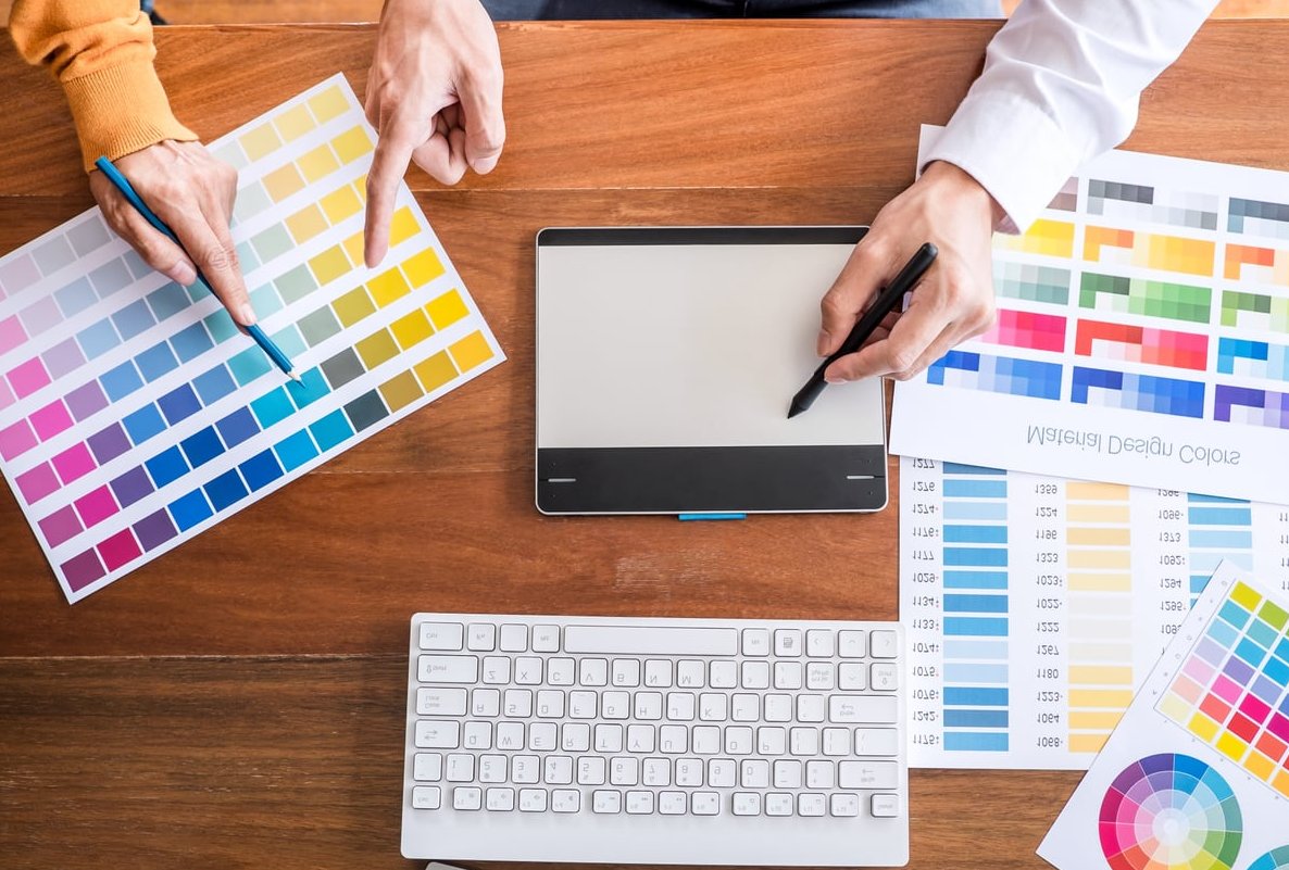
What RGB actually is (additive color)
RGB stands for Red, Green, Blue. Your monitor, phone and tablet emit light. Each pixel mixes three light sources, and the more light you add, the brighter the result. All three at full power gives pure white. All three at zero gives black, because the screen is simply off.
This is called additive color. Because it is generated light rather than reflected light, RGB can produce colors with an intensity that pigment physically cannot match. That neon cyan on your screen is a light show, not a pigment.
Common RGB spaces you will meet:
- sRGB: the safest default for web and general digital delivery.
- Adobe RGB (1998): wider gamut, better at holding saturated cyans and greens that survive conversion to print.
- Display P3: what most modern Apple and high end displays use. Great on screen, deceptive if you design print on it without proofing.
What CMYK actually is (subtractive color)
CMYK stands for Cyan, Magenta, Yellow and Key (black). Ink does not emit anything. It sits on paper and absorbs part of the light hitting it, and you see whatever bounces back. Add more ink and you subtract more light, so the result gets darker and muddier.
This is subtractive color. Three practical consequences:
- The brightest “white” you can get is the paper itself. No ink, no glow.
- Mixing cyan, magenta and yellow at 100% does not give a clean black. It gives a soggy brown-black, which is why K (black) exists as a fourth ink.
- The paper matters enormously. The same CMYK values print noticeably richer on coated stock than on uncoated or recycled stock, which absorbs ink and flattens contrast.

RGB vs CMYK: side by side
| Criteria | RGB | CMYK |
|---|---|---|
| Color principle | Additive (emitted light) | Subtractive (reflected light) |
| Channels | 3 (Red, Green, Blue) | 4 (Cyan, Magenta, Yellow, Black) |
| White is | All channels at maximum | Bare paper, zero ink |
| Black is | Screen off (0,0,0) | K ink, or a rich black mix |
| Gamut size | Wider, especially in blues, greens, oranges | Narrower, limited by pigment |
| Best for | Web, apps, video, social, email, UI | Offset and digital printing, packaging, signage |
| File formats | PNG, JPG, WebP, SVG, GIF | PDF/X, TIFF, EPS, AI, INDD |
| Value notation | 0 to 255 per channel, or hex | 0 to 100% per ink |
Why your vibrant screen colors die in print
The technical word is gamut: the full range of colors a device can reproduce. Plot both on a color chart and the RGB shape swallows the CMYK shape almost everywhere, with the biggest overhang in the saturated blue-to-green corner.
When you convert, every RGB color that sits outside the CMYK gamut has to be dragged inside it. The software picks the nearest printable color it can find. Nearest is not identical. That shift is what you perceive as “dull”, “muddy” or “grey”.
A second factor makes it worse: total ink limit. Presses cap how much ink can sit on one spot, typically around 300% total for coated stock and lower for uncoated or newsprint. A super saturated color that would need 100C + 100M + 90Y + 60K gets forcibly reduced, which flattens it further.
The colors most at risk
| Screen color | Example | What happens in CMYK |
|---|---|---|
| Electric / royal blue | #0000FF, #1E3AFF | The worst offender. Turns purple or navy-violet. Loses all its punch. |
| Neon and lime green | #00FF00, #39FF14 | Goes flat, olive or grass-like. The glow disappears completely. |
| Bright cyan / turquoise | #00FFFF | Reproduces reasonably but visibly softer and less luminous. |
| Fluorescent pink / magenta | #FF00A0 | Drops to a standard pink. Needs a spot ink to survive. |
| Vivid orange | #FF6600 | Loses heat, drifts towards a duller red-orange. |
| Deep violet / purple | #7B00FF | Muddies and darkens, often losing the blue side of the hue. |
| Metallics and neons | Gold, silver, fluoro | Impossible in 4-color process. Requires spot, foil or a 5th unit. |
Colors that convert almost invisibly: reds, warm yellows, browns, beiges, skin tones, greys, muted pastels and most photographic content. If your palette lives there, conversion will barely register.
How to check which mode your file is in
- Photoshop: read the document tab title, it shows RGB/8 or CMYK/8. Or go to Image > Mode.
- Illustrator: the tab title shows the color mode. Or check File > Document Color Mode.
- InDesign: open Window > Output > Separations Preview and set it to Separations. Objects appearing under an RGB-only channel will show up wrong.
- Any PDF: open in Acrobat Pro and use Print Production > Output Preview. If you see RGB objects listed, they have not been converted.
- Windows / macOS: right click a file and look at Properties or Get Info for the color profile.

Set the document up correctly from the start
This single habit prevents more reprints than any conversion trick. Designing in RGB and converting at the deadline means you approved colors you were never going to get.
Illustrator
- File > New and choose the Print preset.
- Expand Advanced Options and set Color Mode: CMYK, Raster Effects to 300 ppi.
- Add your bleed here, usually 3 mm (or 0.125 in), before you draw anything.
- Set Edit > Color Settings to a print preset matching your region and confirm the CMYK working space with your printer.
Photoshop
- File > New, choose Print, set 300 pixels/inch.
- Here is the nuance: for photo retouching, work in RGB (16-bit if possible) and convert at the very end. Many filters, adjustment layers and blend modes behave badly or are disabled in CMYK.
- Keep an RGB master file. Convert a flattened copy for output.
InDesign
- InDesign documents are output-profile driven, so set Edit > Color Settings to your print CMYK profile.
- Build swatches as Process CMYK or as Spot if you are paying for a spot ink.
- Place linked images rather than pasting them, and let the PDF export handle conversion.
Which CMYK profile should you pick?
| Profile | Where / when |
|---|---|
| U.S. Web Coated (SWOP) v2 | North America, general commercial coated printing |
| GRACoL 2013 (CRPC6) | North America, modern sheetfed coated work |
| PSO Coated v3 (FOGRA51) | Europe, coated stock, current standard |
| PSO Uncoated v3 (FOGRA52) | Europe, uncoated and recycled stock |
| Japan Color 2001 Coated | Japan and much of Asia |
Always ask your print supplier which profile they want. Thirty seconds of email beats a guess.
Conversion workflow in Illustrator
- Duplicate the file first. Conversion is destructive to your original color values.
- Turn on soft proofing: View > Proof Setup > Customize, pick your target CMYK profile, tick Simulate Paper Color, then View > Proof Colors. You now see the print reality on screen.
- Go to File > Document Color Mode > CMYK Color.
- Open the Color panel and inspect each key brand color. If a swatch shows the out of gamut warning triangle, click it to snap to the nearest printable value, then judge whether you can live with it.
- Hand-tune the critical ones. For blues that flip purple, cut the magenta: try around 100C 70M 0Y 0K instead of the automatic conversion which often lands near 100C 90M.
- Check gradients and effects. Drop shadows, glows and transparency built in RGB can band or shift after conversion. Re-apply them in CMYK if they look wrong.
- Check embedded and linked raster images. Convert them separately in Photoshop for better control than Illustrator’s blanket conversion.
- Save your final swatch set as a CMYK library so the next job starts correct.

Conversion workflow in Photoshop
- Flatten a copy: Image > Duplicate, then flatten. Keep the layered RGB master untouched.
- Soft proof: View > Proof Setup > Custom, select your CMYK profile, then View > Proof Colors (Ctrl/Cmd + Y).
- Turn on View > Gamut Warning (Ctrl/Cmd + Shift + Y). Everything highlighted in grey will shift when you convert.
- Fix problems before conversion, while you still have full RGB editing power. A Hue/Saturation layer pulling saturation down 5 to 15% on the offending range usually looks better than letting the engine crush it.
- Boost contrast and mid-tone punch slightly with Curves. Print tends to compress contrast, so a little pre-compensation reads as “normal” on paper.
- Convert properly with Edit > Convert to Profile, not Image > Mode. Convert to Profile lets you choose the rendering intent.
- Relative Colorimetric with Black Point Compensation: best for logos, flat brand colors and most work.
- Perceptual: best for photographs with lots of saturated detail, since it shifts all colors smoothly instead of clipping.
- Sharpen after conversion and at final output size, not before.
- Save as PDF, TIFF or PSD with the profile embedded.
The black and grey traps nobody warns you about
- RGB black (0,0,0) converts to a four-color muddy black. For body text, always use 100% K only. Four-color small text goes fuzzy the moment registration drifts by a hair.
- Rich black for large areas: 100% K alone looks washed out over big fills. Use something like 60C 40M 40Y 100K for a deep neutral black, and confirm the total ink limit with your printer.
- Never use registration black (100/100/100/100). It is a press alignment color, not a design color, and it will soak the sheet.
- Neutral greys: build them from K only, or the grey will pick up a cast as inks drift on press.
When CMYK simply is not enough: spot colors
If your brand lives on a color that process ink cannot hit, four-color printing will never save it. Options:
- Pantone spot ink: a pre-mixed ink applied as a fifth unit. The only reliable way to get consistent, vivid corporate blues, oranges and fluoros.
- Fluorescent or metallic inks: for effects CMYK physically cannot render.
- Foil stamping, spot UV or specialty finishes: often a better answer than fighting a color you cannot win.
- Choose a print-friendly brand color from the start. If you are building an identity now, test it in CMYK before locking it. A color that survives both screen and press saves years of compromise.

Export settings that protect your colors
- PDF/X-4: the modern choice. Keeps live transparency and color management. Use it unless told otherwise.
- PDF/X-1a: everything flattened and forced to CMYK. Very safe, still requested by many packaging and offset printers.
- Set Output to Convert to Destination (Preserve Numbers) so already-correct CMYK values are left alone.
- Include 3 mm bleed and crop marks if requested.
- Do not downsample images below 300 ppi at final size.
Pre-flight checklist before you send to print
- Document color mode is CMYK.
- The correct CMYK profile is applied and matches the printer’s spec.
- All linked and embedded images are CMYK at 300 ppi minimum.
- Body text is 100% K only.
- Large black areas use a rich black build within the ink limit.
- No stray RGB or unused spot swatches in the Swatches panel.
- Bleed and safe margins are respected.
- Fonts outlined or fully embedded.
- You have soft proofed with Simulate Paper Color turned on.
- For any high-value run, you ordered a physical proof on the actual stock. No monitor, however good, replaces paper in your hand.
Frequently asked questions
Is it better to use CMYK or RGB?
Neither is better in absolute terms. Use RGB for anything viewed on a screen, because it offers a wider gamut and is what displays natively speak. Use CMYK for anything printed with ink on a press, because that is what the machine actually reproduces. The mistake is using one where the other belongs.
Do I need to convert RGB to CMYK for printing?
Yes for commercial offset and most professional digital printing. The conversion will happen with or without you. If you do it yourself with soft proofing, you control the result. If you leave it to the printer’s RIP, you accept whatever automatic conversion it applies. One exception: some large-format, inkjet and photo labs prefer sRGB files because their devices manage the conversion internally. Ask before assuming. More at https://neodesynz.com.
Why don’t printers use RGB?
Because printers put pigment on paper, and pigment works by subtracting light rather than emitting it. There is no ink that behaves like a backlit pixel. Combining cyan, magenta and yellow also fails to produce a clean black, so a dedicated black ink is added. RGB simply has no physical equivalent in the ink world.
How do I know if my image is RGB or CMYK?
In Photoshop check the document tab or Image > Mode. In Illustrator check the tab title or File > Document Color Mode. On your desktop, view the file’s Properties (Windows) or Get Info (macOS) for the color profile. Also useful: if the file is a PNG, GIF or WebP, it is RGB, since those formats do not support CMYK.
Can I convert CMYK back to RGB?
Technically yes, but you never recover the colors lost in the first conversion. It is a one-way trip in practice. Always keep an RGB master file and export CMYK versions from it.
What about Canva and other browser tools?
Browser-based design tools work in RGB internally. Some offer a CMYK PDF export on paid plans, which applies an automatic conversion you cannot fine-tune. It is fine for simple, low-risk jobs. For brand-critical or packaging work, build the file in Illustrator or InDesign where you control the profile and rendering intent.
Why does my print look different from the proof I approved on screen?
Three usual suspects: an uncalibrated monitor, no soft proofing with paper simulation, and the paper stock itself. Uncoated and recycled stock absorbs ink and reduces contrast noticeably compared with coated. Calibrate your display, soft proof properly, and for anything expensive, get a physical proof on the real stock.
The takeaway
The RGB vs CMYK issue is not solved by a last-minute conversion. It is solved by deciding, before your first shape hits the artboard, whether the file is destined for light or for ink, then setting up the document accordingly and soft proofing the whole way through. Do that, and the proof that lands on your desk will look exactly like the one you approved.